
do less...
[ This space intentionally left blank. ]
How to Create NBA Shot Charts in Python (just like Kirk Goldsberry!)
Though he’s an assistant professor in the Department of Geography at Michigan State University and a visiting scholar at the Harvard Center for Geographic Analysis, Kirk Goldsberry is known amongst sports fans for one thing: his NBA shot charts.
Ever since the New York Times published the first iterations of them back in 2012, armchair analysts around the world have enjoyed studying the Skittles-meets-SportVu works of data visualization art.
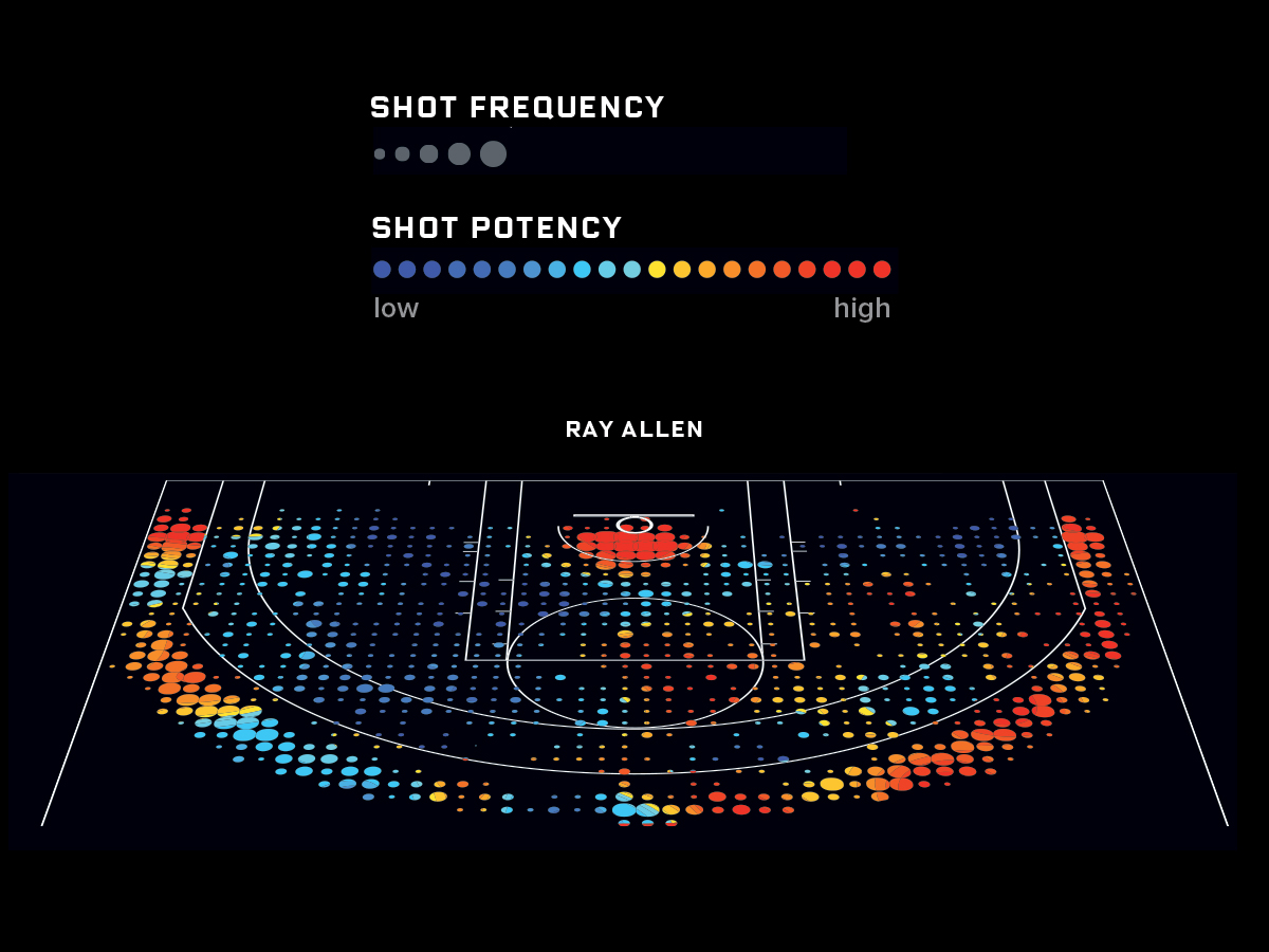
And now, thanks to a wonderful human named Savvas Tjortjoglou, you can be just like Kirk.
I stumbled upon Savvas’ blog as part of my quest to become the ultimate writer/coder and immediately reached out to him asking if we could syndicate his incredibly cool ‘How to Make NBA Shot Charts’ post on Random Nerds#. Fortunately for everyone reading this, he said yes, and now here we are.
I’ve embedded his site below, but if you want to reach out to thank him or have any questions for him, you can email him at [email protected] or find him on Twitter @savvas_tj. And since this article is based centrally on Savvas’ work, all Patronizing dollars from this article will go to him not me.
“You have to prioritize communication of ideas. Too often ‘numbers guys’ fail because after their great analyses they fail to ‘land the plane’ – they don’t make it digestible to the readers.” – Prophet Goldsberry
Submitted To Data Viz, NBA, Sports
Like what you read? Share it.
(That helps us.)
Love what you read? Patronize Bryce Rudow.
That helps us and the writer.
What is Patronizing? Learn more here.